Wedding Crest Ideas
Three directions. One very personal beginning.
From a flowing ribbon to garden flowers or a beloved pet, a wedding crest can tell your story in a small space. Compare these ideas, picture them on your wedding day, then start with the direction you love.
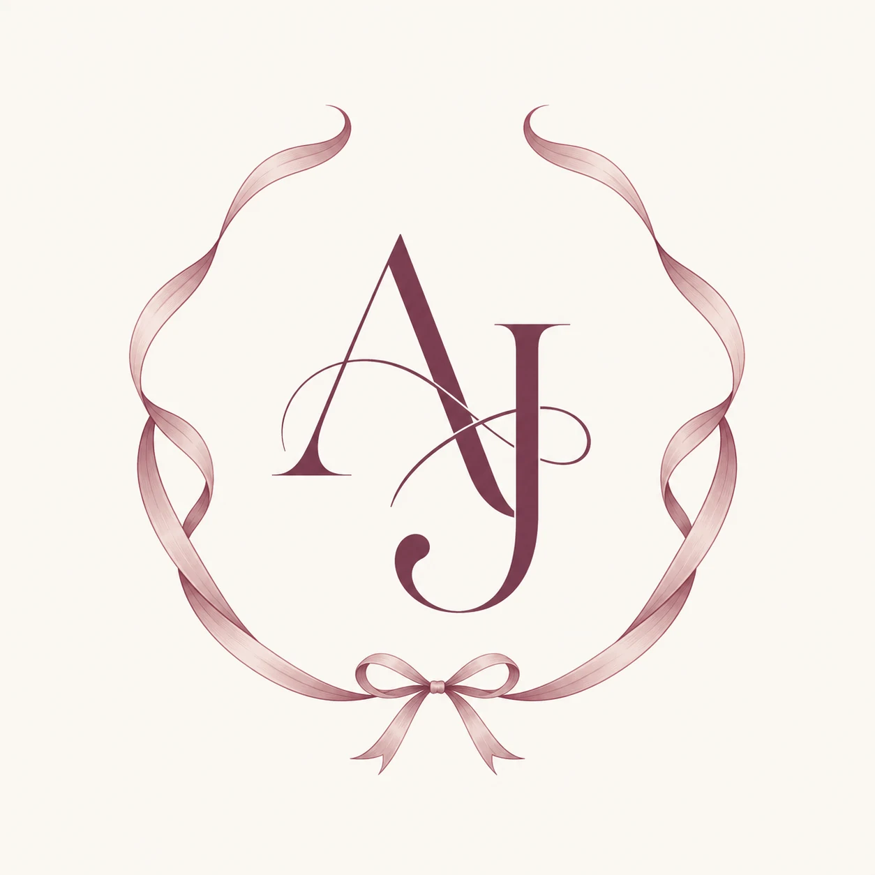
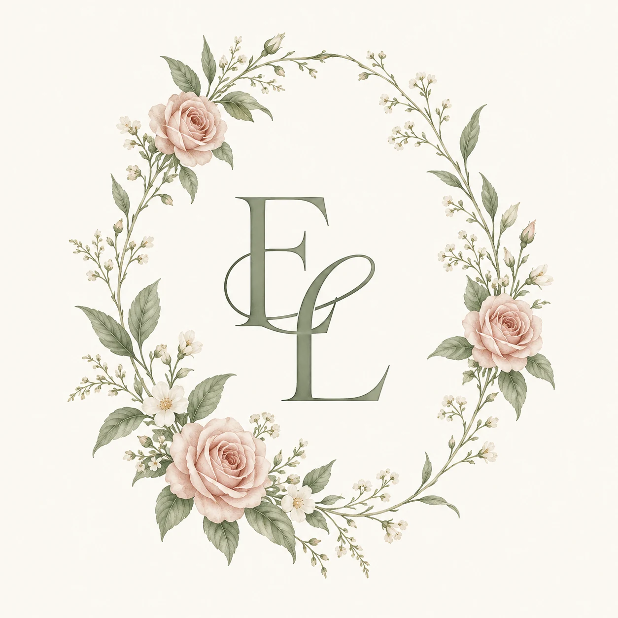
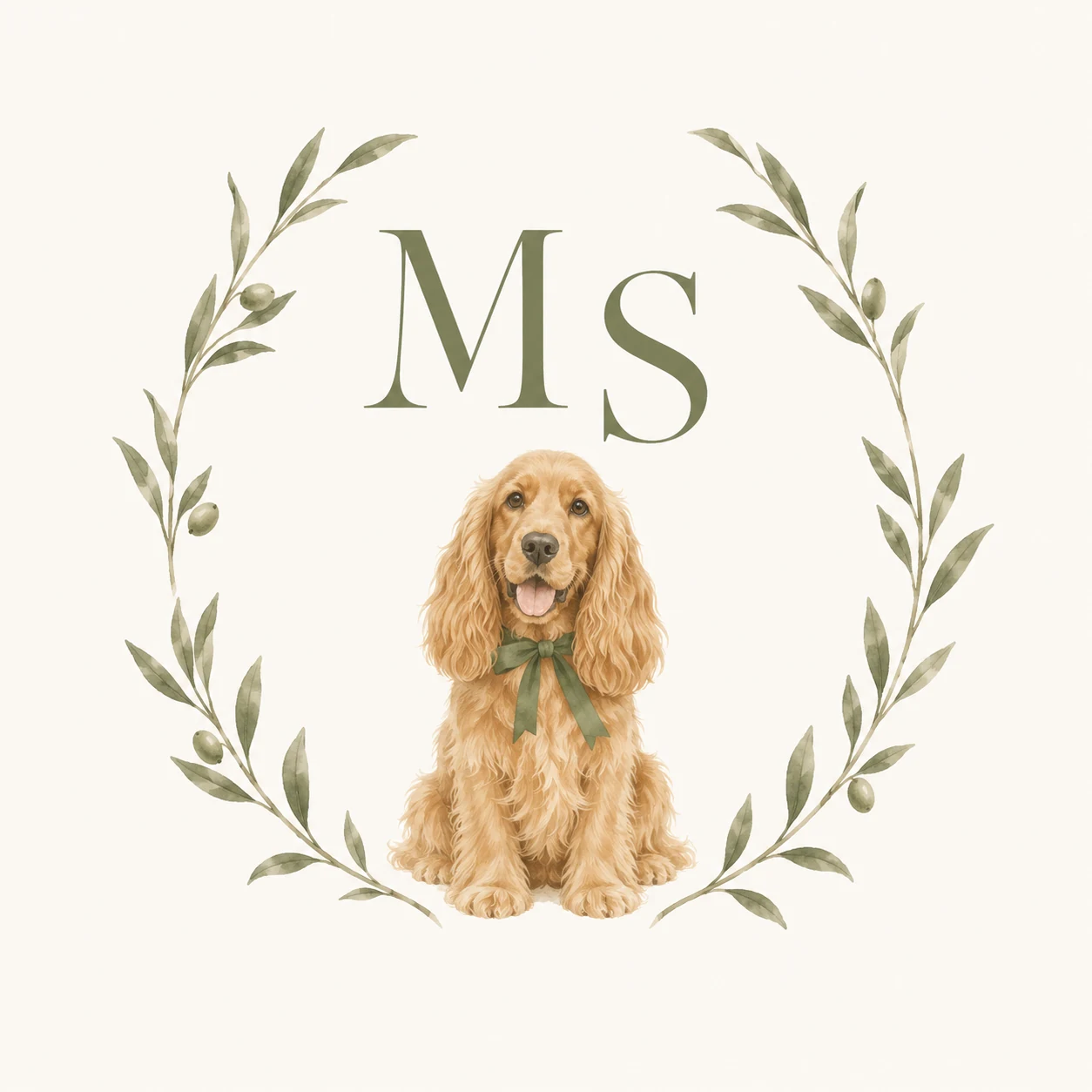
Studio concept artwork and application mockups. Your generated crest will be a new interpretation, with your own details.
Which wedding crest style feels like you?
Choose the shape and mood first, then personalize the colors and symbols. These three design directions use minimal line art or botanical watercolor as their starting styles.
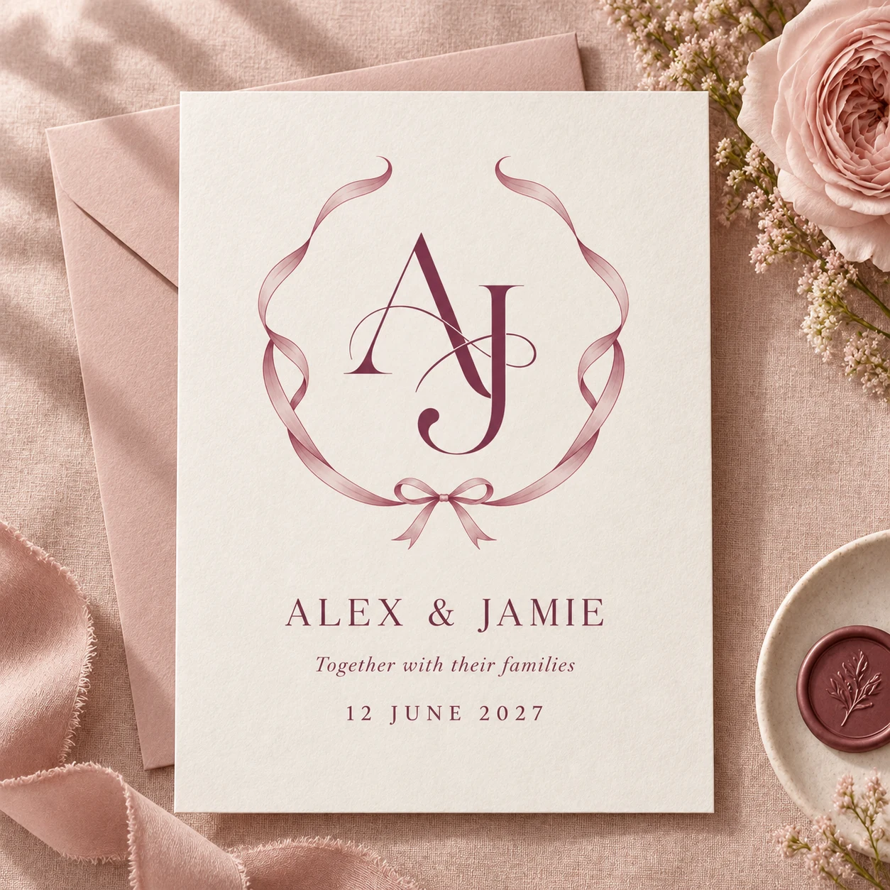
Invitation concept
A ribbon, two initials, room to breathe.
For a modern celebration with a romantic touch
Let the lettering lead. A flowing ribbon gives the initials a frame without filling the design with flowers. Berry adds definition; dusty rose softens the edges. This direction suits a city wedding, an intimate dinner or stationery with plenty of open space.
- Berry
- Dusty rose
- Warm ivory
Start your brief: Start with your initials, Minimal Line Art, an oval frame and a berry, dusty rose and ivory palette. Keep the detail level minimal so the letterforms have space.
Put it to use: Try it on an invitation with a generous margin and simple wording below the crest. Repeat the berry in your envelope or place-card lettering instead of adding another decorative motif.
A detail to check: Check that overlapping initials remain easy to distinguish when the crest is small.
Try the ribbon direction See the Ribbon Vows collection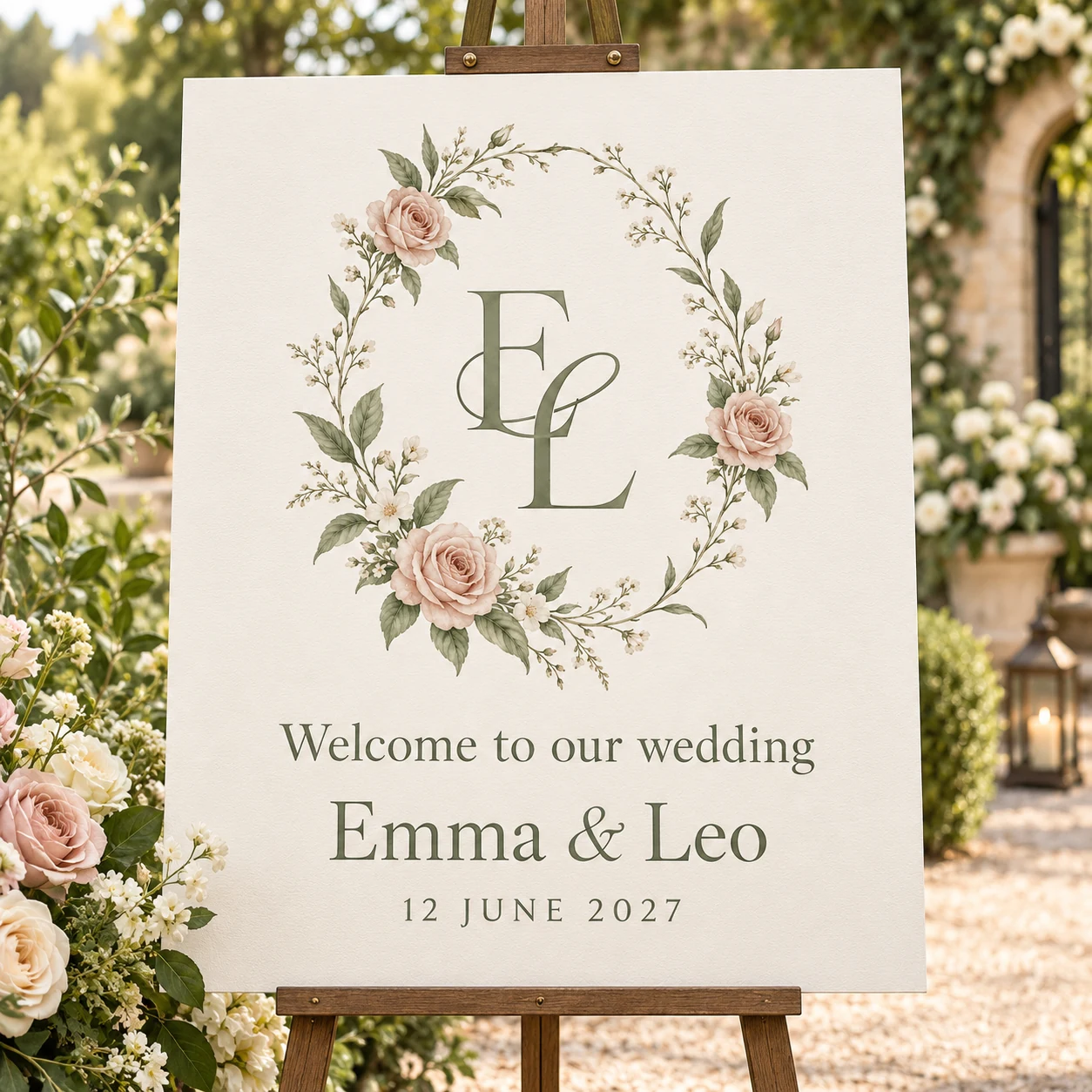
Welcome sign concept
Bring a little of the garden to the page.
For a garden ceremony or a countryside weekend
An airy wreath of roses, small flowers and greenery creates a softer silhouette. Sage keeps the initials connected to the leaves, while blush adds warmth. Choose this direction when you want your flowers and paper details to feel like part of the same celebration.
- Sage
- Blush
- Warm ivory
Start your brief: Choose Botanical Watercolor, an oval frame, Rose and Wildflower, with sage, blush and warm ivory. Balanced detail leaves room for both the wreath and your initials.
Put it to use: Give the crest a generous area on a welcome sign, with the welcome message and names set separately below it. Carry the sage into the wording so guests recognize the same visual theme from their invitation.
A detail to check: Look closely at pale petals and fine stems in a print proof; a large screen preview can hide delicate details.
Try the garden direction See the Garden Vows collection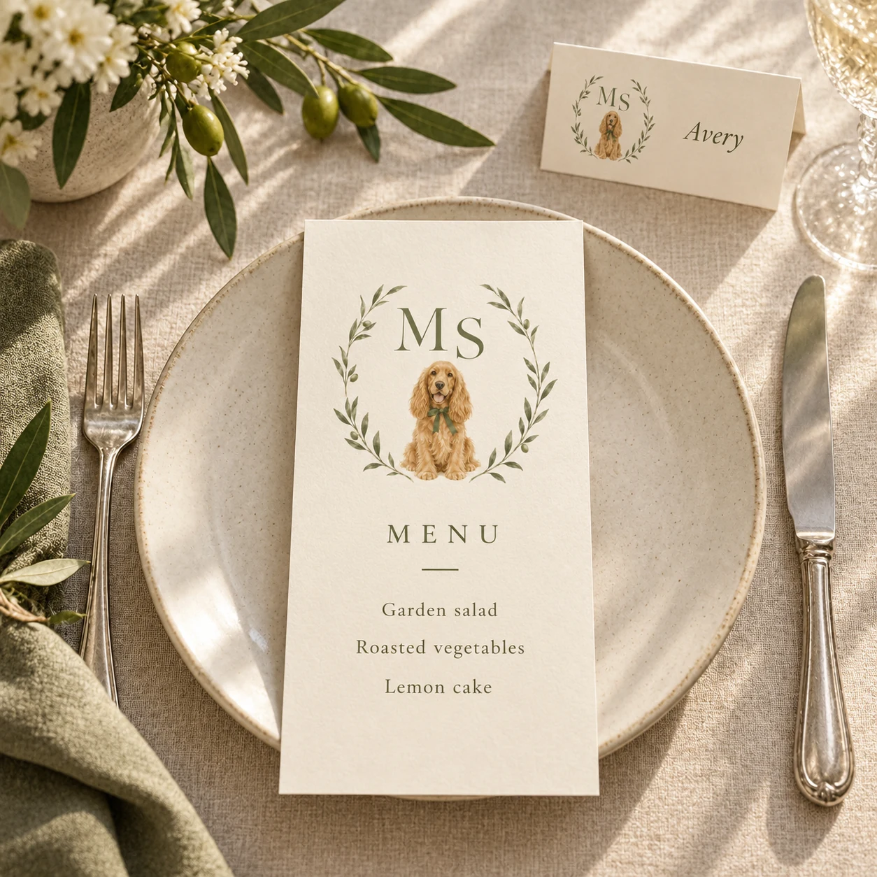
At the table concept
A small detail that could only be yours.
For a relaxed celebration with a personal story
Make one meaningful symbol the heart of the crest. Here, a dog sits below the initials inside olive branches. The restrained greenery gives that personal detail room to stand out, while olive, cream and ochre feel warm and welcoming.
- Olive
- Cream
- Warm ochre
Start your brief: Choose Botanical Watercolor, Olive Branch and the Dog personal element. Begin with olive, cream and warm ochre, an oval frame and balanced detail. This is a pet-inspired direction, not a portrait-matching service.
Put it to use: Use the crest on a menu or thank-you card where guests can enjoy the personal detail up close. On a small place card, keep the guest’s name more prominent than the crest.
A detail to check: Choose one personal motif first. A pet, several flowers and multiple objects can compete with the initials.
Try the personal direction See the Our Little Family collectionHow to use a wedding crest throughout the day.
Emma & Leo’s garden concept shows how a floral monogram and a sage-and-blush palette can connect three different pieces. Once you have a crest you love, reuse the downloaded artwork in your layouts instead of generating a new crest for every item.
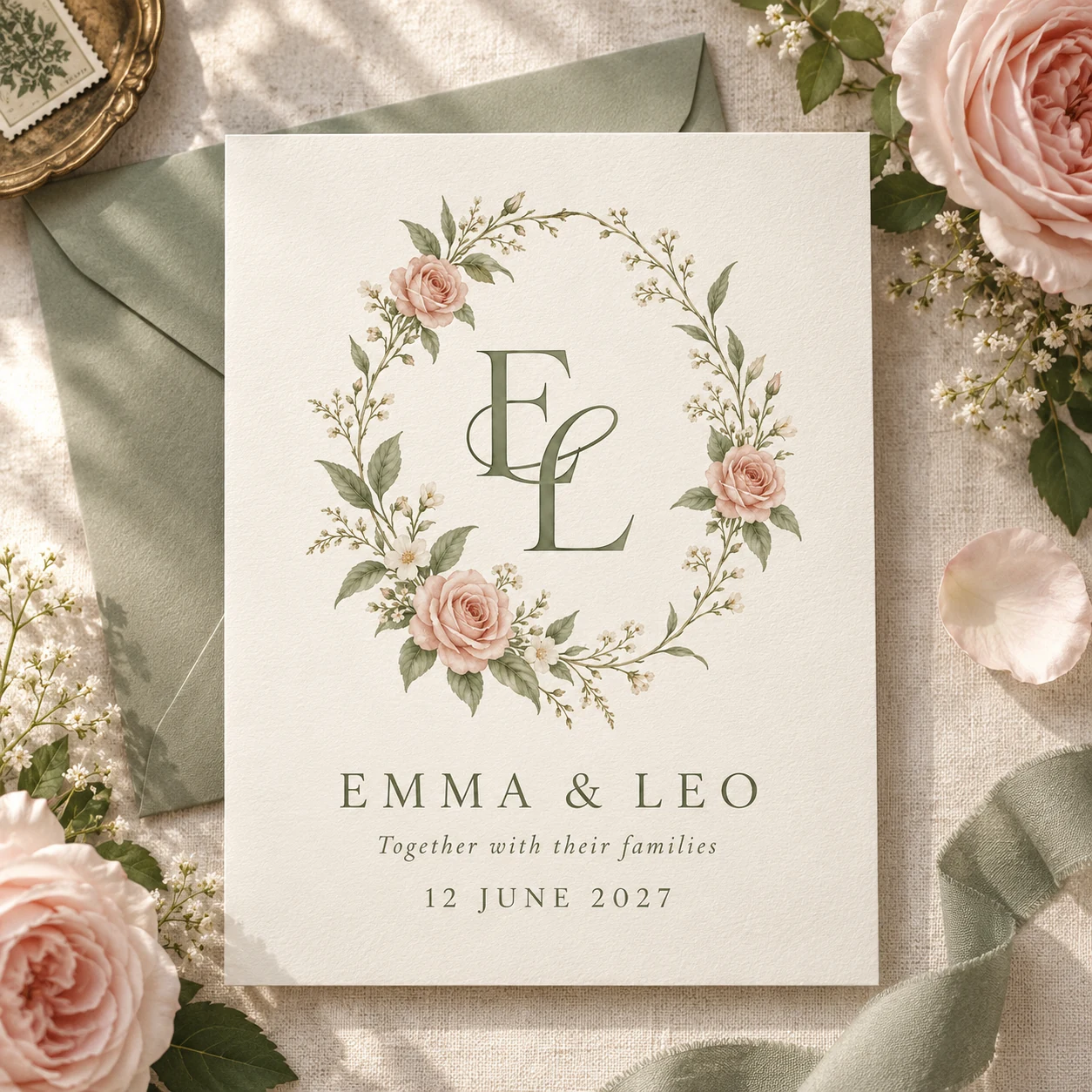
01 / In the envelope
Introduce the crest on your invitation. Leave room for names, date and venue rather than asking the artwork to carry every event detail. Use the same palette on the envelope and reply card.
02 / At the entrance
Reuse the approved crest on a welcome sign. Make the greeting readable from a distance, and ask your printer which file format and artwork size suit the finished board.
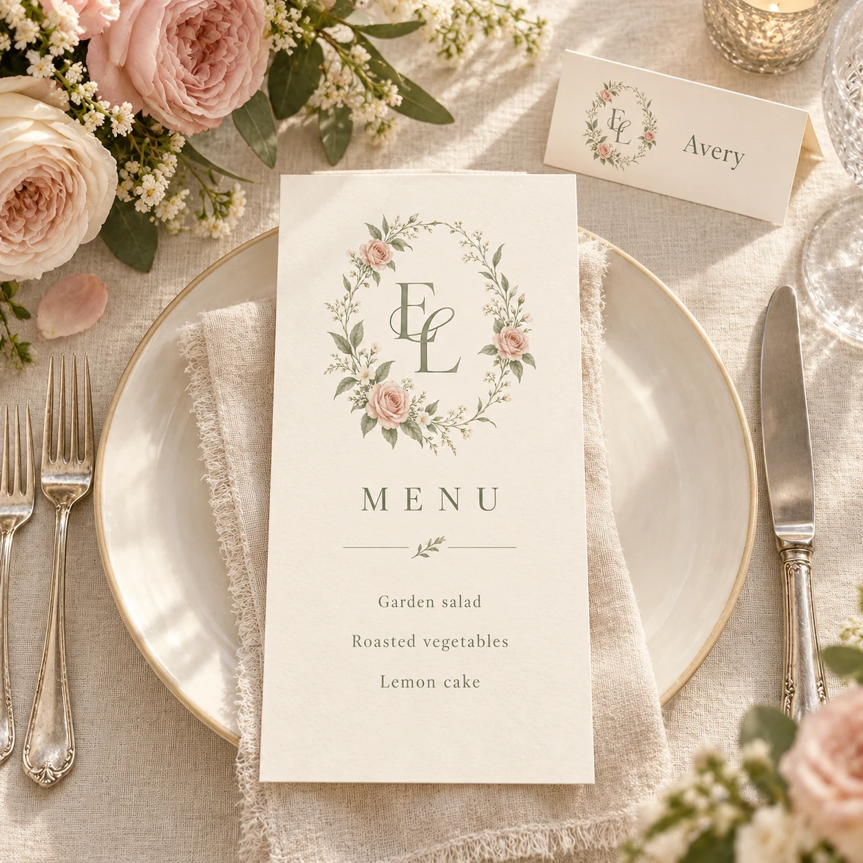
03 / At each place setting
Reduce the crest for menus and place cards, keeping the menu or guest name in separate text. Review the initials at the actual size; use the palette alone if a tiny crest loses its detail.
These coordinated scenes are application concepts, not photographs of printed customer orders. The download is your crest artwork; stationery layouts and printing are not included.
See a complete wedding crest invitation exampleA crest that belongs to the two of you.
You do not need every idea in one design. A clear starting direction makes it easier to decide what belongs.
Follow the step-by-step crest tutorialChoose one direction.
Use a style button above to open its palette, frame and details in the generator. Add your names and check the date. The example names are not copied into your brief.
Make one detail personal.
Keep a flower from your bouquet, choose a meaningful color or add a personal symbol. Give the initials space rather than filling every gap.
Review, then reuse.
Check the lettering, date and fine details in your preview. Sign in to save and download PNG or SVG artwork. Place the same approved crest into your invitation, sign and menu layouts; proof each at its intended size.
A few questions before you begin.
What should I include in a wedding crest?
Start with initials or names, a frame and two or three colors. Add one meaningful element, such as flowers or a pet. A date is optional; keep it in the surrounding stationery wording if you want to reuse the crest after the wedding.
Can a wedding crest be simple?
Yes. A ribbon or a restrained border around two initials can feel complete without flowers. The ribbon direction above is a starting point if you want the lettering to be the main feature.
Will my result look exactly like these examples?
No. The buttons apply each collection’s starting settings, then AI creates a new interpretation using your details. The examples help you choose a direction; they are not editable templates or an exact reproduction promise.
Can I use my crest on colored paper or fabric?
The current PNG and SVG artwork includes its background. You can use a light panel as part of the layout. For a seamless colored surface, prepare and check a transparent version separately. SVG export alone does not remove the background. For embroidery or specialty printing, ask the supplier how the design needs to be adapted.
Do I get the invitation and sign designs too?
You download the crest as PNG or SVG, then arrange it with your event wording in a layout editor or work with a stationery designer. Names inside the crest are part of the artwork, not editable text. For a worked example, follow our wedding crest invitations guide.